Supplier scorecard metrics are the weighted set of KPIs, usually four to six, that measure how a vendor performs on quality, delivery, cost, service, and risk or ESG factors. The practical rule is simple: score each metric on a consistent 1 to 5 rubric, weight the categories by how much risk that supplier actually carries, and link every low score to a corrective action with a named owner and a due date. Skip that last part, and you have a report, not a management tool.
TL;DR:
- Focus on core KPIs like quality, delivery, cost, service, and ESG, weighted by supplier risk and linked to specific corrective actions.
- Use a maximum of four to six KPIs with clear, scale-based scoring, and prioritize category risk and supplier criticality when selecting metrics.
- Map supplier scores to defined tiers, with specific actions such as volume increase or corrective plans for each level, and escalate nonperformance automatically.
- Keep dashboards simple, showing performance trends, heatmaps, root causes, and CAPA statuses, with data from reliable sources like ERP and TMS platforms.
- Avoid tracking too many KPIs, scoring without evidence, or neglecting the corrective action process, as scorecards are management tools only when paired with follow-up actions.
Table of Contents
- What Are the Core KPI Categories for Supplier Scorecards?
- How Do You Choose Metrics and Design the Scoring Model?
- What Does a Supplier Scorecard Template Actually Look Like?
- How Do Scores Turn Into Corrective Actions?
- What Belongs on a Supplier Performance Dashboard?
- What Mistakes Undermine Most Supplier Scorecards?
- How Commerce Catalyst Uses Scorecard Data in Financial Diagnostics
- The Part of Supplier Scorecarding Everyone Gets Wrong
- Sources
What Are the Core KPI Categories for Supplier Scorecards?
Most functioning scorecards revolve around five categories: quality, delivery, cost, service or responsiveness, and ESG or compliance. Each one exists because it answers a different question a buyer actually asks. Quality tells you whether the product works. Delivery tells you whether it shows up when promised. Cost tells you what it really costs once the hidden expenses surface. Service tells you how the supplier behaves when something goes wrong. ESG and compliance tell you whether the relationship carries reputational or regulatory exposure you haven’t priced in yet.
Teams typically assign two to four specific KPIs inside each category, then weight them to reflect risk rather than treating every metric as equally important. A single-source component supplier and a commodity packaging vendor should never share the same weighting logic.
Here’s how the most common KPIs are actually calculated:
- On-time delivery (OTD/OTIF): the percentage of orders delivered in full and on time, calculated as (orders delivered complete and on schedule ÷ total orders) × 100.
- Lead time: the elapsed calendar days between purchase order issuance and receipt of goods, tracked as an average and a variance range.
- Defect rate / PPM: defective units divided by total units received, often expressed as parts per million for high-volume manufacturing.
- First-pass yield: the percentage of units that pass inspection without rework, a sharper quality signal than defect rate alone because it captures hidden labor cost.
- Invoice accuracy: the share of invoices that match the purchase order and receipt without a dispute or correction.
- Price variance: the difference between contracted price and invoiced price, flagging silent cost creep before it compounds.
- Total cost of ownership (TCO): unit price plus freight, rework, expediting fees, and quality escapes, which is almost always higher than the quoted price alone.
- Response time: hours or days between a query or issue report and a substantive supplier reply.
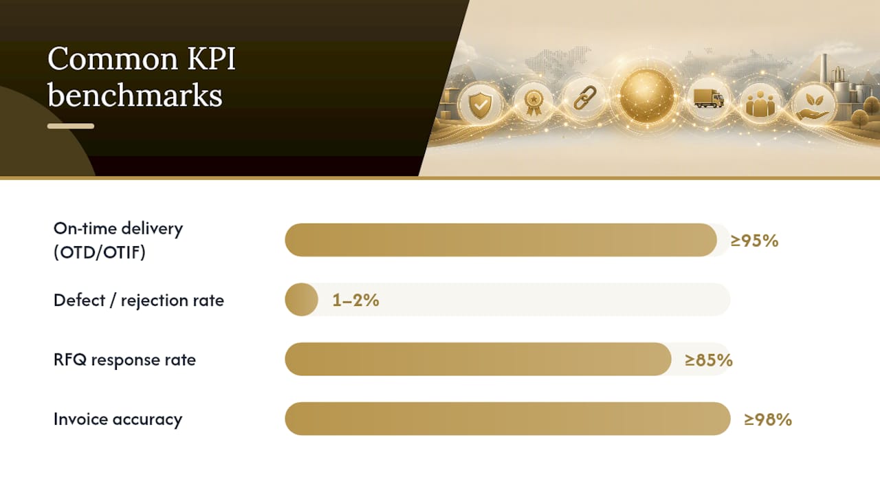
Common benchmark ranges worth anchoring against: OTD/OTIF at or above 95%, defect or rejection rates at or below 1 to 2%, RFQ response rates at or above 85%, invoice accuracy at or above 98%, and corrective-action resolution within a short, reasonable timeframe (https://www.auravms.com/blogs/supplier-evaluation-scorecard-template). Treat these as calibration points, not universal law. A supplier of custom tooling with an eight-week lead time and a supplier of injection-molded closures with a two-week lead time shouldn’t be graded on identical delivery curves. Freight and logistics KPIs deserve the same scrutiny, particularly if you’re tracking 3PL cost benchmarks alongside supplier delivery data, since the two numbers often move together.
How Do You Choose Metrics and Design the Scoring Model?
Pick metrics through a decision flow, not a wish list. Work through it in order:
- Assess category risk first. A sole-source ingredient supplier carries more risk than a five-vendor commodity category, and that risk should determine how many KPIs you track and how tightly you monitor them.
- Rate supplier criticality. Strategic suppliers, the ones tied to your hero SKUs or your only qualified source, warrant the full scorecard. Transactional vendors don’t.
- Check data availability before committing to a KPI. A metric you can’t measure reliably is worse than no metric at all, because it produces false confidence.
- Narrow to four to six core KPIs. Programs that exceed that range consistently see reviewer fatigue and declining data quality, which quietly undermines every score that follows.
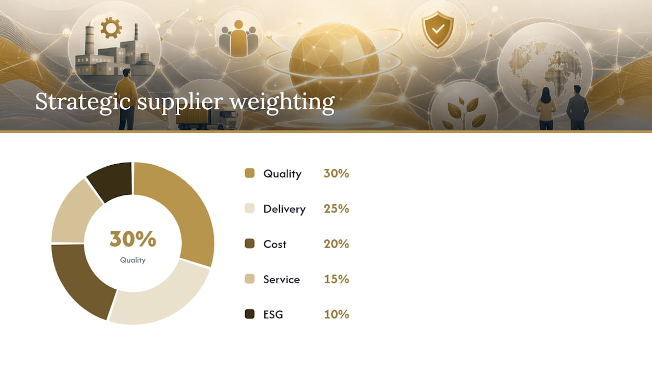
Weighting should vary by category, not follow a template. A typical strategic-supplier split might run Quality 30%, Delivery 25%, Cost 20%, Service 15%, and ESG 10%. There’s no universal formula. There’s only a defensible rationale you can explain to a supplier’s account manager without flinching.
For scoring scales, use 1 to 5 with written anchors, not vague labels like “good” or “poor.” A 3 should mean something specific and repeatable across reviewers, not a gut feeling that shifts by whoever’s filling out the form that quarter.
Pro Tip: For strategic suppliers where nonperformance carries real hidden cost, calculate a Supplier Performance Index alongside your weighted score: SPI = (Purchase Price + Nonperformance Cost) / Purchase Price. An SPI above 1 means rework, expediting, and lost sales are quietly inflating what you thought was a competitive unit price.
What Does a Supplier Scorecard Template Actually Look Like?
A working template stays boring on purpose. Here’s a compact version covering the core metrics:
The weighted total is (4×0.30)+(3×0.25)+(5×0.20)+(3×0.15)+(4×0.10) = 3.9 out of 5, which typically lands in the “approved” tier depending on your thresholds.
For sign-off and cadence:
- Strategic suppliers get scored quarterly, reviewed by category manager and quality lead jointly.
- Transactional suppliers can move to semiannual or annual review without much loss of insight.
- Every scorecard needs a reviewer signature block before it’s considered final, not just a saved spreadsheet.
How Do Scores Turn Into Corrective Actions?
A score without consequence is just an opinion with decimal points. The weighted total should map to a tier, and each tier should carry a defined action:
- Preferred (4.5–5.0): Increase volume allocation, extend contract terms, consider strategic partnership status.
- Approved (3.5–4.49): Maintain current business, monitor trends, no immediate intervention required.
- Conditional (2.5–3.49): Require a formal corrective action plan (CAPA) with a named owner and a due date, typically 30 to 60 days out.
- At-risk (below 2.5): Freeze new volume, escalate to sourcing leadership, and begin qualifying an alternate supplier in parallel.
Every CAPA needs three things to actually function: an owner who isn’t the buyer who placed the order, a due date tracked against a calendar rather than “soon,” and a verification step confirming the fix held. Skip verification and you’ll relearn the same lesson next quarter. This is also where supplier relationship management tactics matter. A CAPA delivered as a partnership conversation gets better results than one delivered as a compliance memo.
Escalation should be automatic, not discretionary. If a supplier misses two consecutive CAPA due dates, that triggers an executive review, no exceptions carved out for “but they’re our biggest vendor.”
What Belongs on a Supplier Performance Dashboard?
A dashboard earns trust by showing four things clearly: performance trend over time, a distribution or heatmap across your supplier base, root-cause drilldowns when a score drops, and live CAPA status. Anything beyond that starts diluting attention rather than adding insight.
The data feeding those panels has to come from somewhere reliable:
- ERP systems supply receipt events and PO-versus-invoice matching.
- QMS or inspection platforms supply defect and rejection data.
- AP feeds supply invoice accuracy and dispute logs.
- TMS or logistics platforms supply on-time delivery timestamps.
Tool selection should follow data maturity, not the other way around. A team with clean ERP and QMS feeds can automate most of this. A team without them should start with a manual quarterly build, get the definitions right, then automate. Building a clean financial dashboard for the business overall follows the same sequencing logic: structure before automation, always.
What Mistakes Undermine Most Supplier Scorecards?
The failure modes repeat across industries because they’re structural, not situational:
- Tracking ten or more KPIs, which guarantees reviewer fatigue and sloppy inputs.
- Assigning scores with no supporting evidence, which makes disputes impossible to resolve.
- Scoring without linking to a CAPA, so nothing ever actually changes.
- Setting weights once and never revisiting them as supplier risk shifts.
Pro Tip: Calibrate your reviewers quarterly for strategic suppliers. Two people scoring the same supplier should land within half a point of each other. If they don’t, your anchors aren’t specific enough yet.
How Commerce Catalyst Uses Scorecard Data in Financial Diagnostics
Chris Wichert built Commerce Catalyst’s advisory work around a simple observation: supplier performance data rarely gets connected to cash flow decisions, even though it should. A weighted scorecard showing chronic late deliveries or invoice mismatches often points directly to the working capital drag founders bring to a financial diagnostic. Turning that scorecard data into prioritized action is exactly the constraint-finding work a DTC Operator Diagnostic is built for.
The Part of Supplier Scorecarding Everyone Gets Wrong
Most guidance on supplier scorecards focuses on what to measure. That’s the easy half. The harder, more valuable half is what happens after the score gets calculated, and that’s where most programs quietly fail.
Start there. The KPI list matters less than the discipline behind it.
Sources
- Supplier Scorecards: How to Benchmark Supplier Reliability, Quality & ESG - Certainty Software
- Supplier Evaluation Scorecard: Template + Best Practices | AuraVMS Blog
- Free Vendor Scorecard Template | Evaluation Excel | Sourced
- Performance measurements and metrics: analysis of supplier evaluation (NCSU)